Next, I was tasked to create hybrid images, that is, given 2 input images, create an image that seemingly changes
appearance as a function of viewing distance. We accomplish this by high pass filtering (HPF) one image, low pass
filtering (LPF) the other image, and then adding the images together. I accomplished the HPF in the same manner as
part 0, taking the difference between the original image and a Gaussian blurred version of the image, and the LPF is
accomplished just by applying a Gaussian to the original image.
Additionally, the images were always aligned, then gray scaled, then filtered, then combined. The alignment code
(which was given to us) uses 2 user-defined points on the images to align them together. Naturally, I chose images
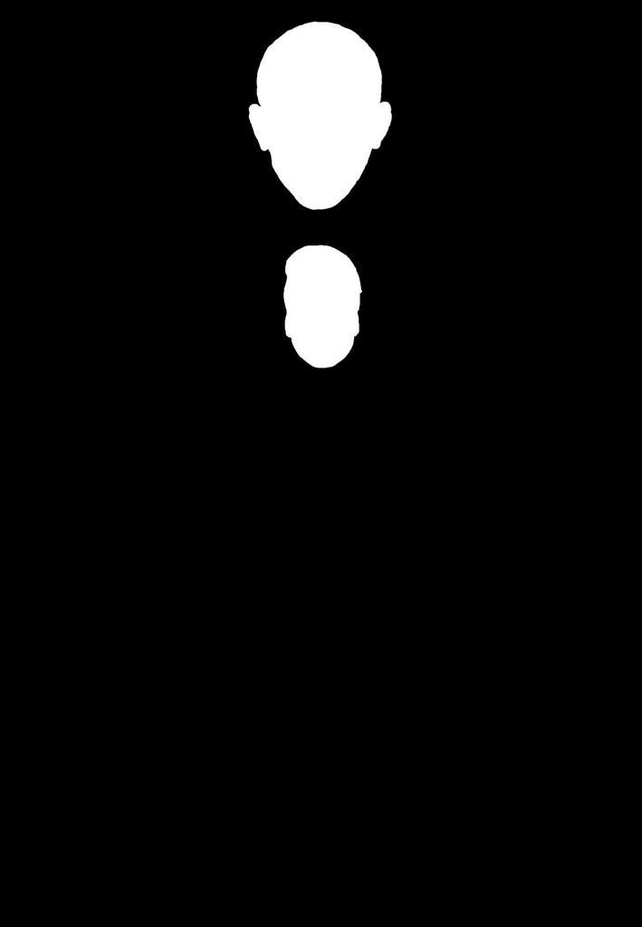
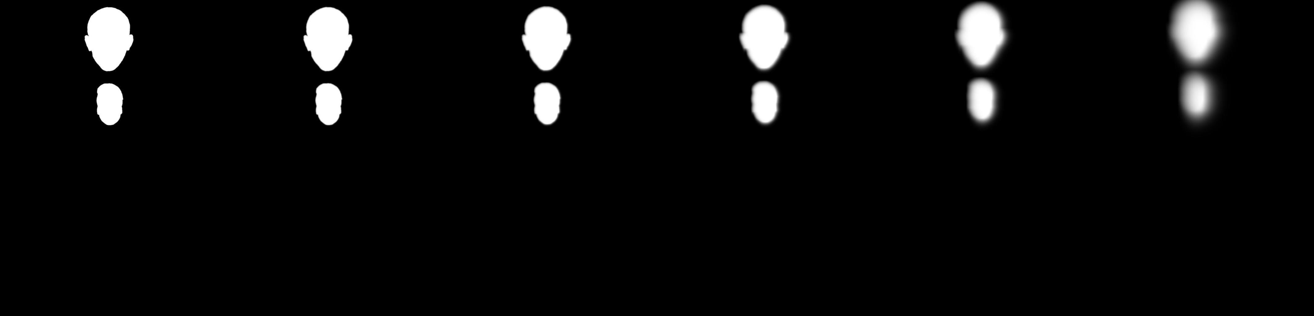
with forward facing portraits and subjects with two visible eyes. I used the eyes in every pair of photos as the
alignment points.
I found that a sigma value of 7 on the LPF and 15 on the HPF worked the best. I followed the 3 * sigma rule of
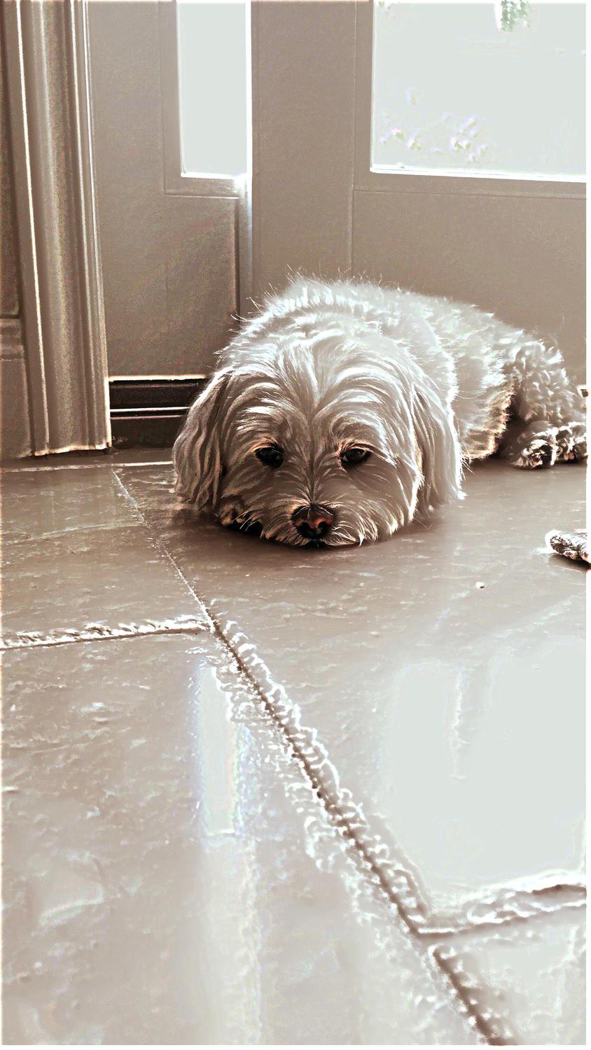
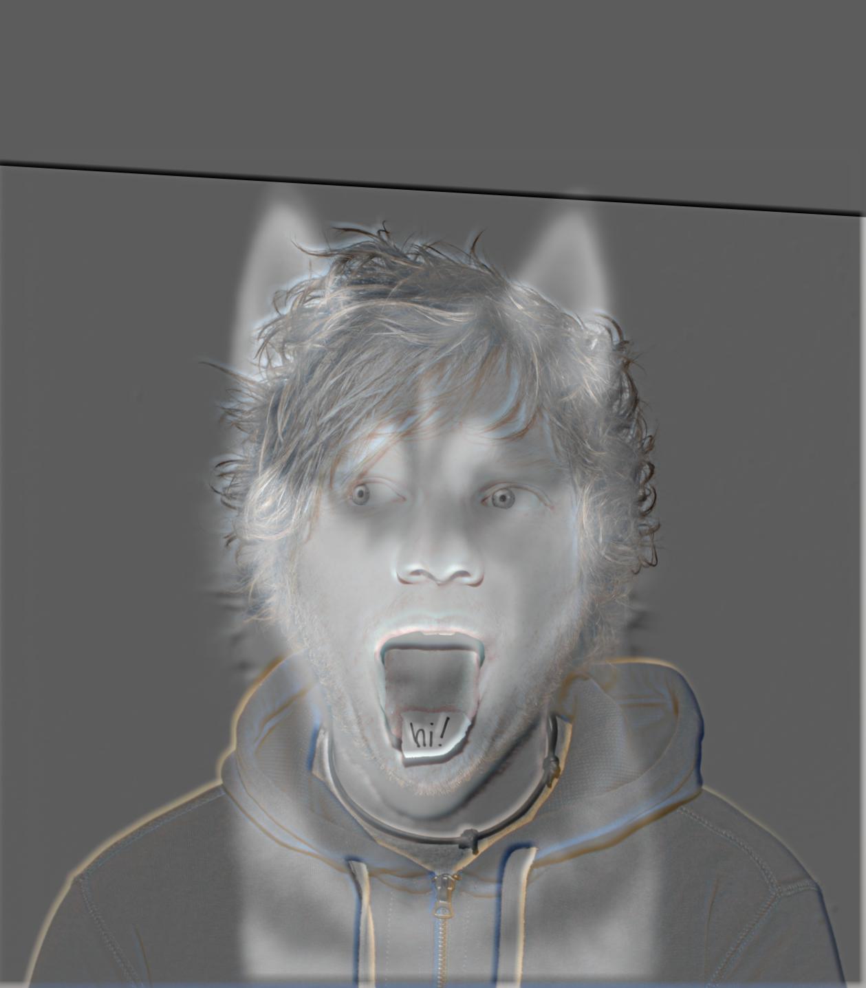
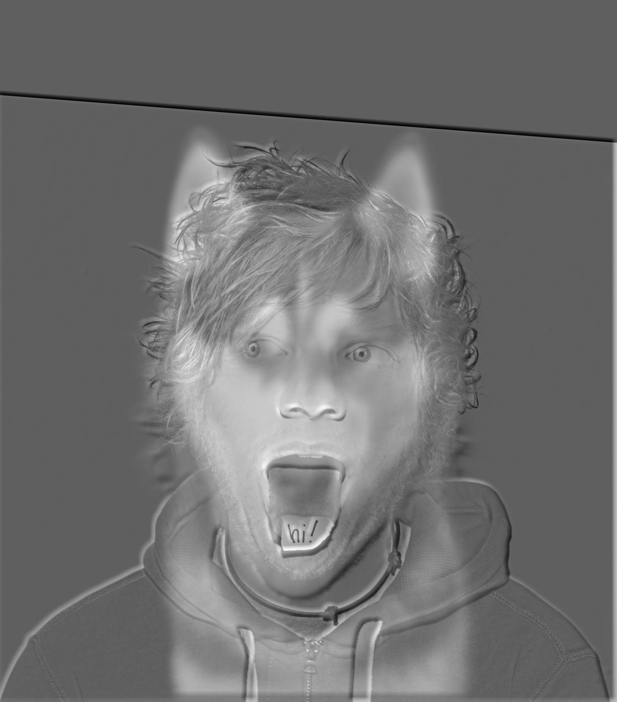
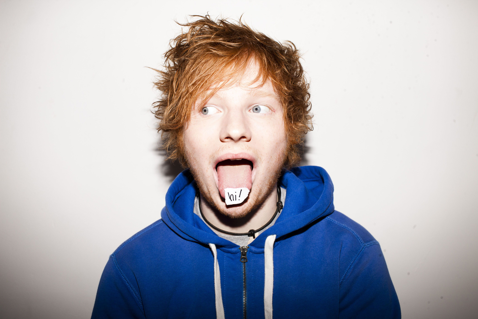
thumb and used a 21 x 21 window on the LPF and a 45 x 45 window on the HPF. Below is my favorite result:
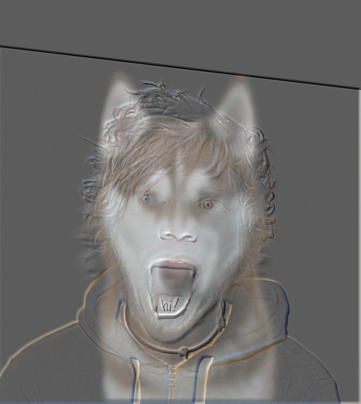
Try walking away from your computer and
viewing from a distance!
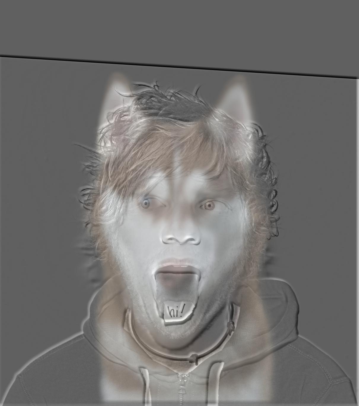
(Ed Sheeran should disappear and the husky should become more visible.)

Hybrid photo of Ed Sheeran and a husky
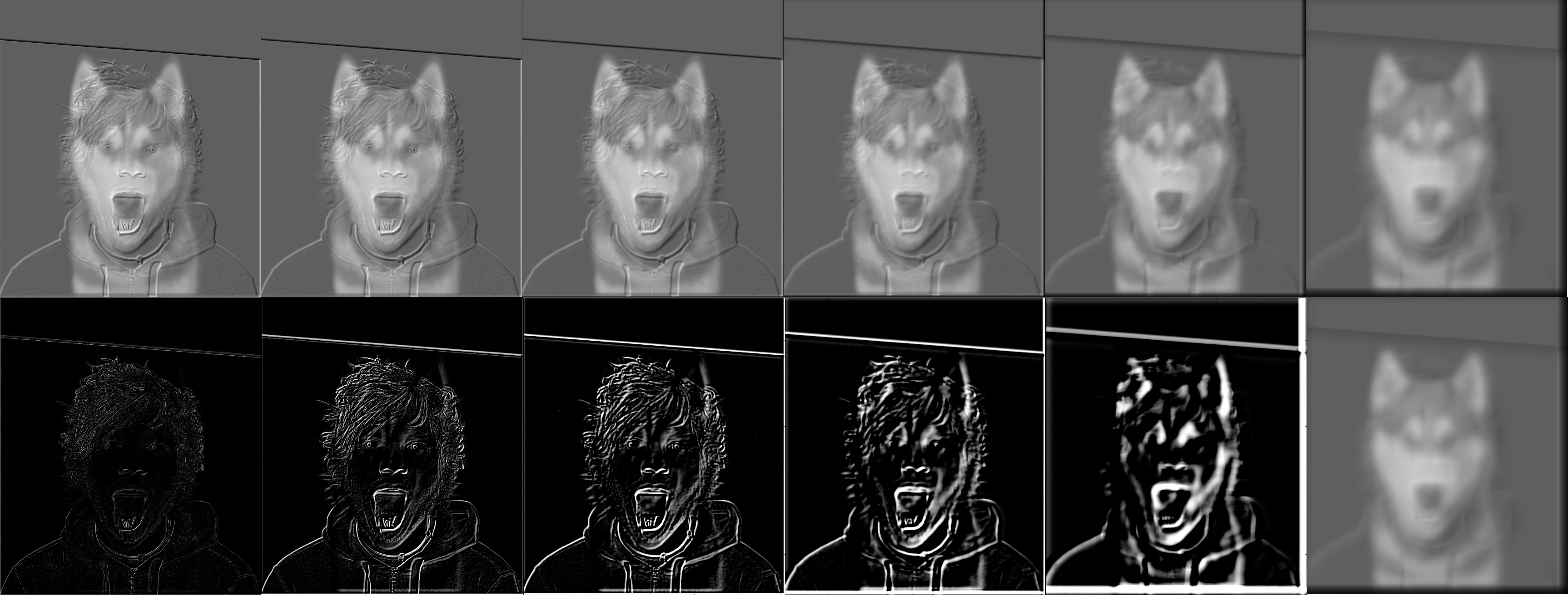
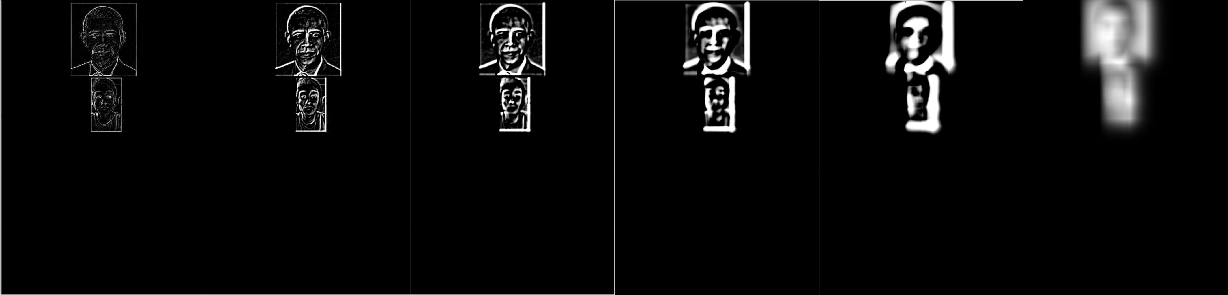
Here are some pictures detailing the process of creating the hybrid image:
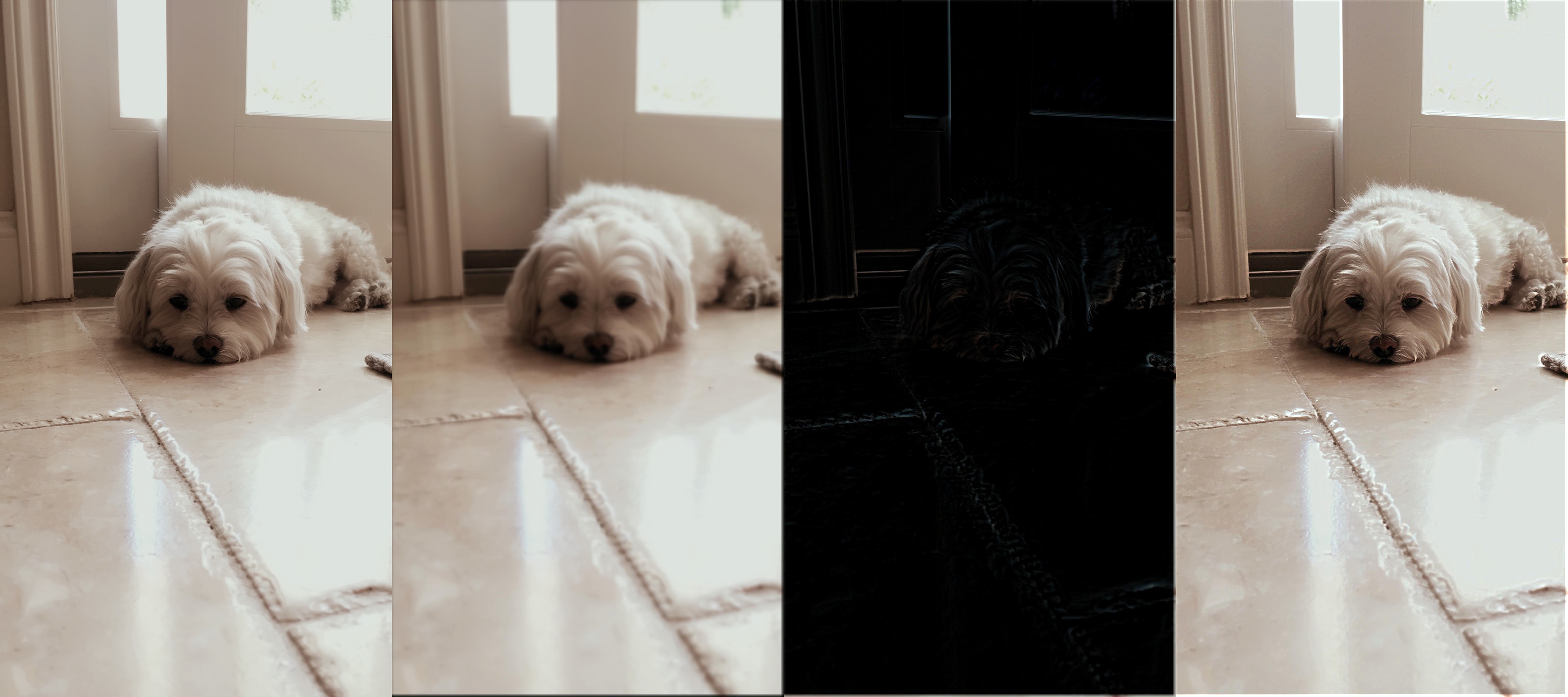
Original Images and their Fourier Transforms (FT)
Original Ed
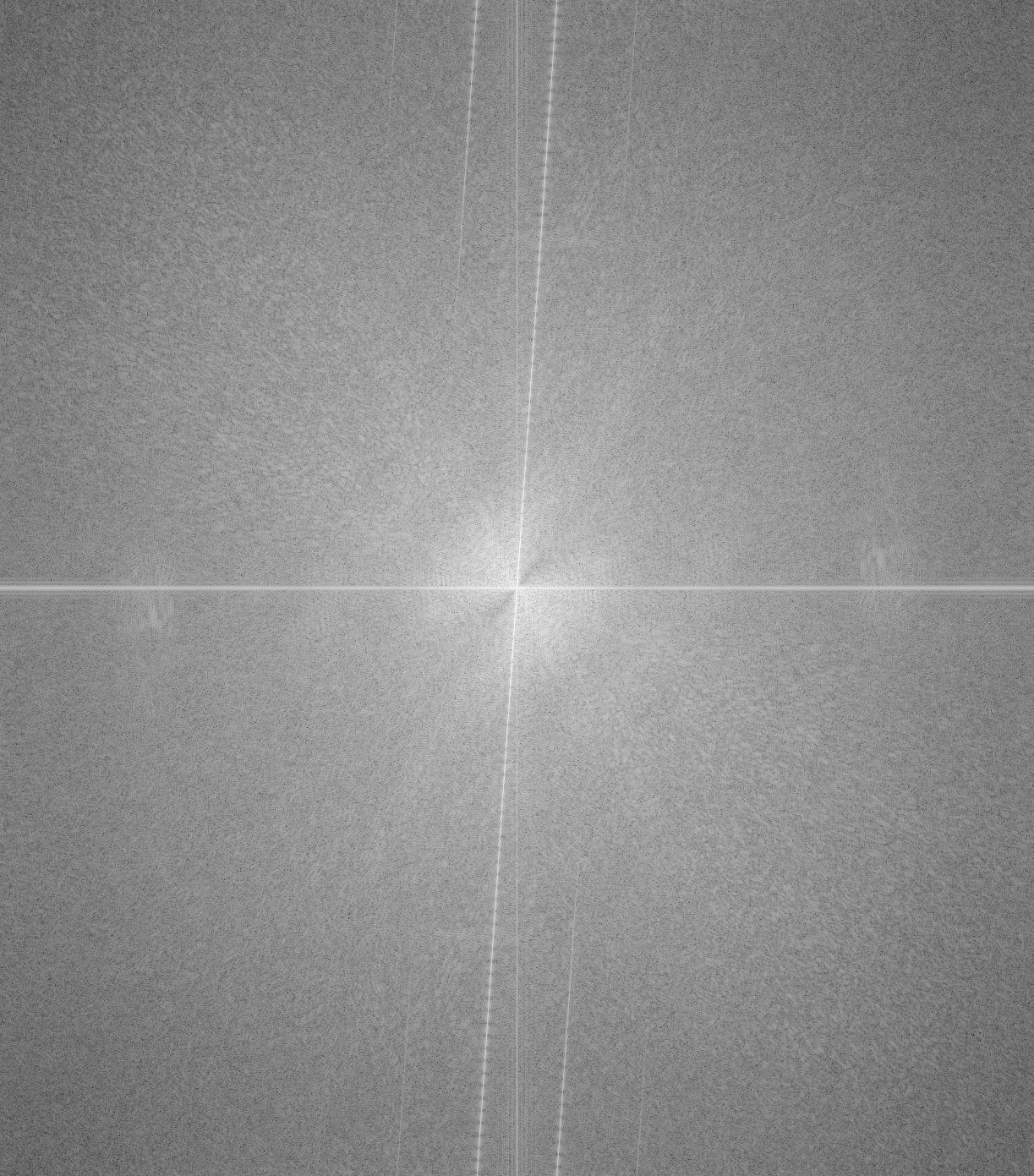
Ed's FT
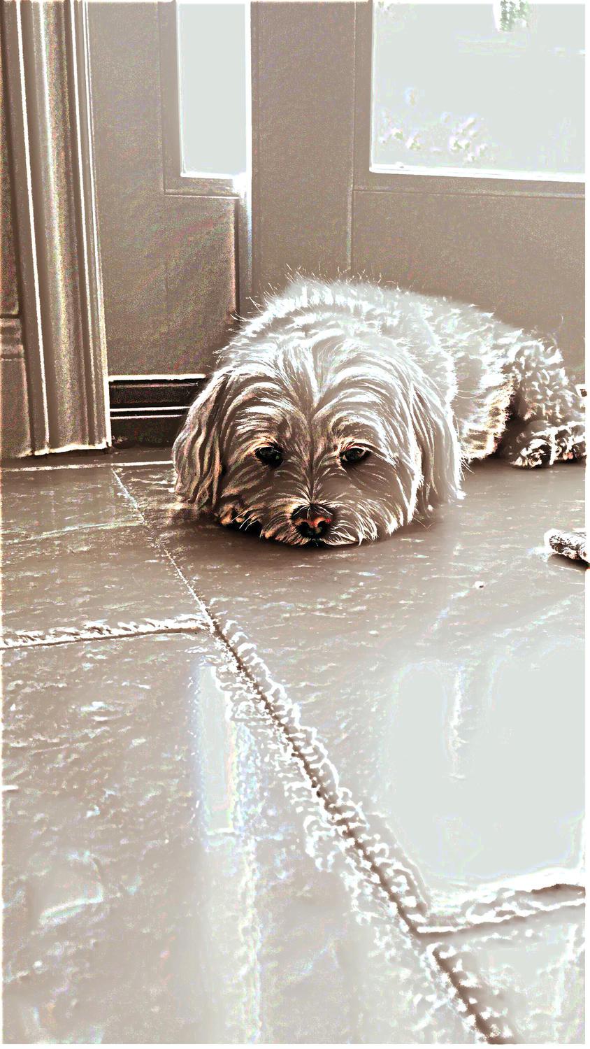
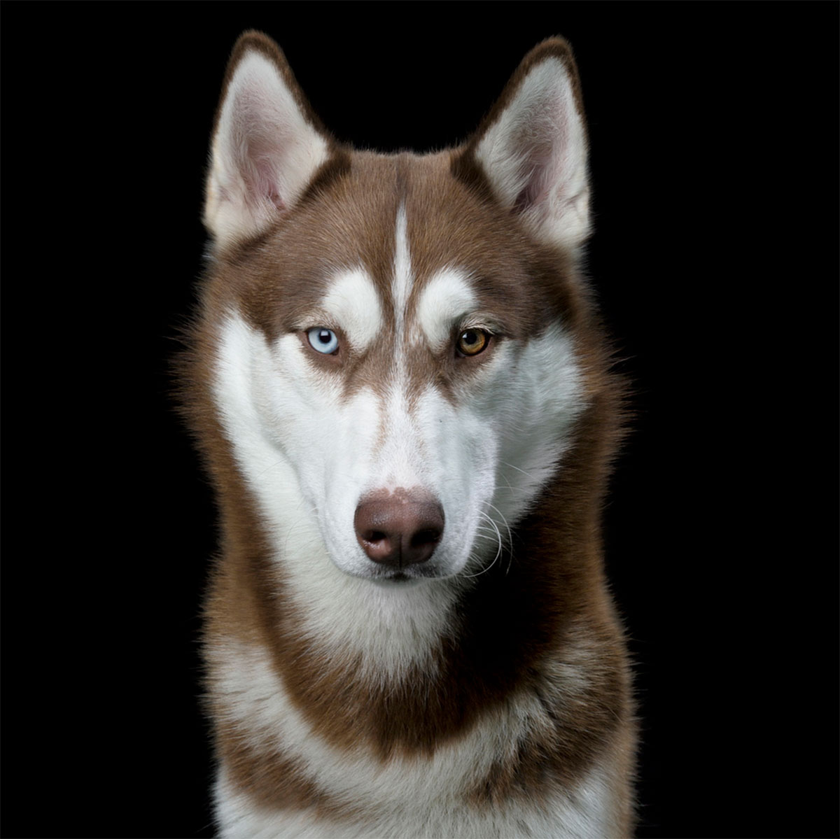
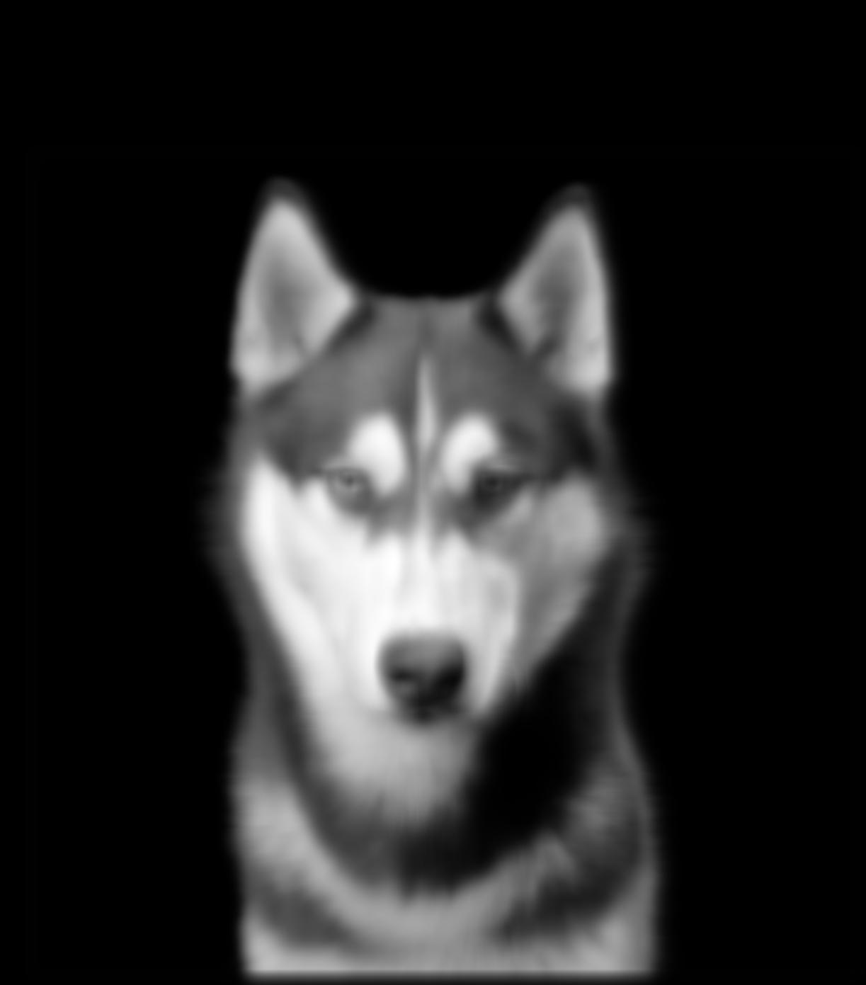
Original Husky
Husky's FT
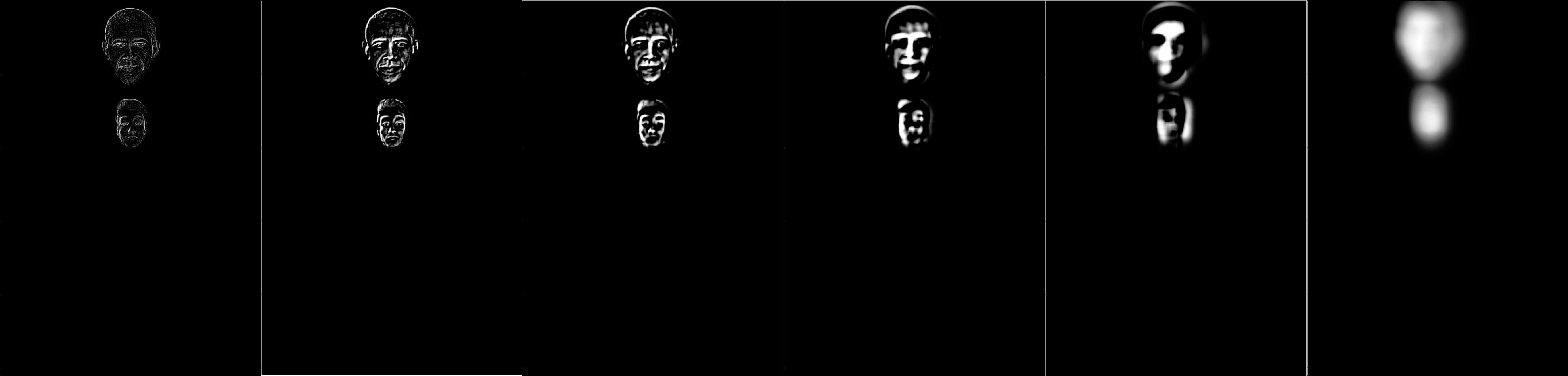
Filtered Images and their FT's
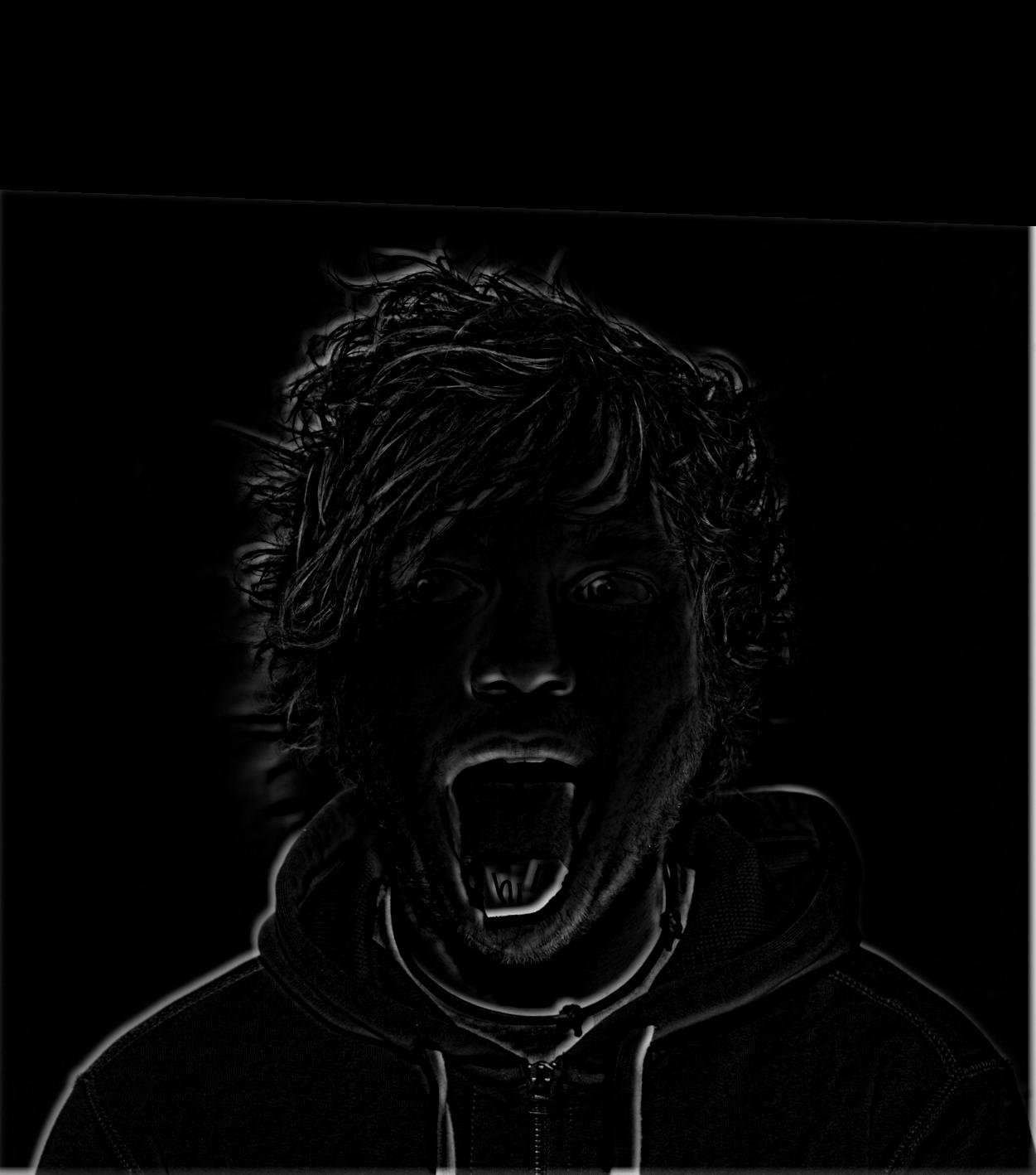
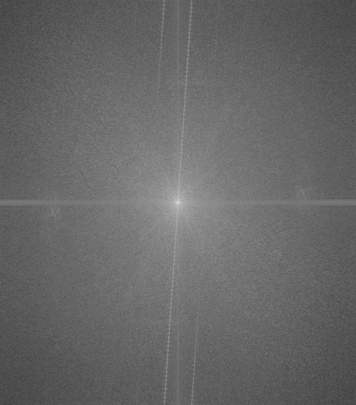
HPF'd Ed
Filtered Ed's FT
(As expected, has become brighter due to the HPF.)
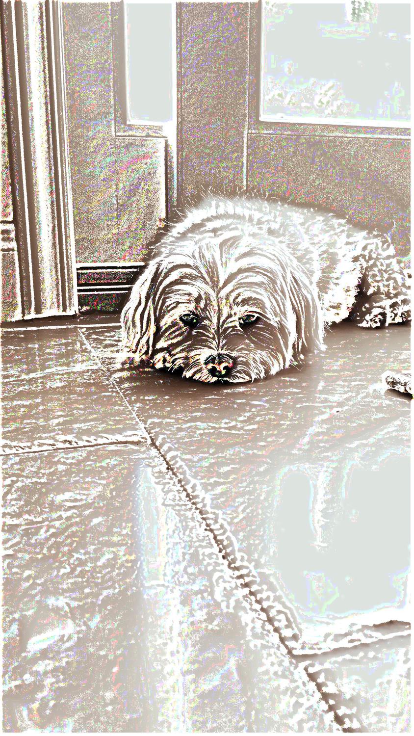
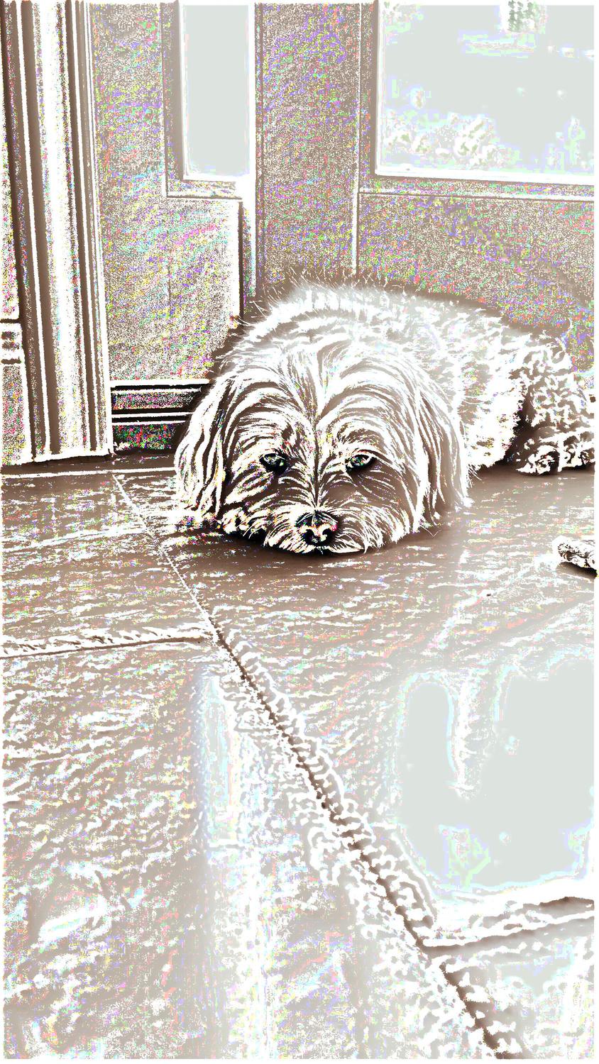
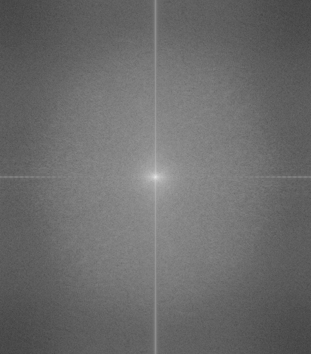
LPF'd Husky
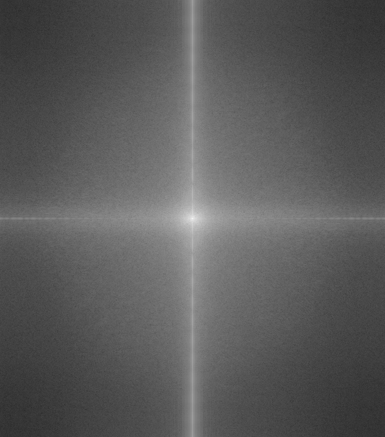
Filtered Husky's FT
(As expected, has become darker as the high frequencies are
filtered out.)
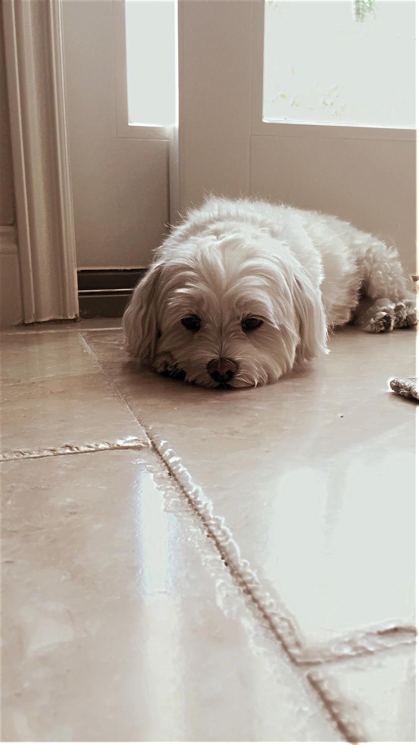
Result
Resulting Hybrid Image
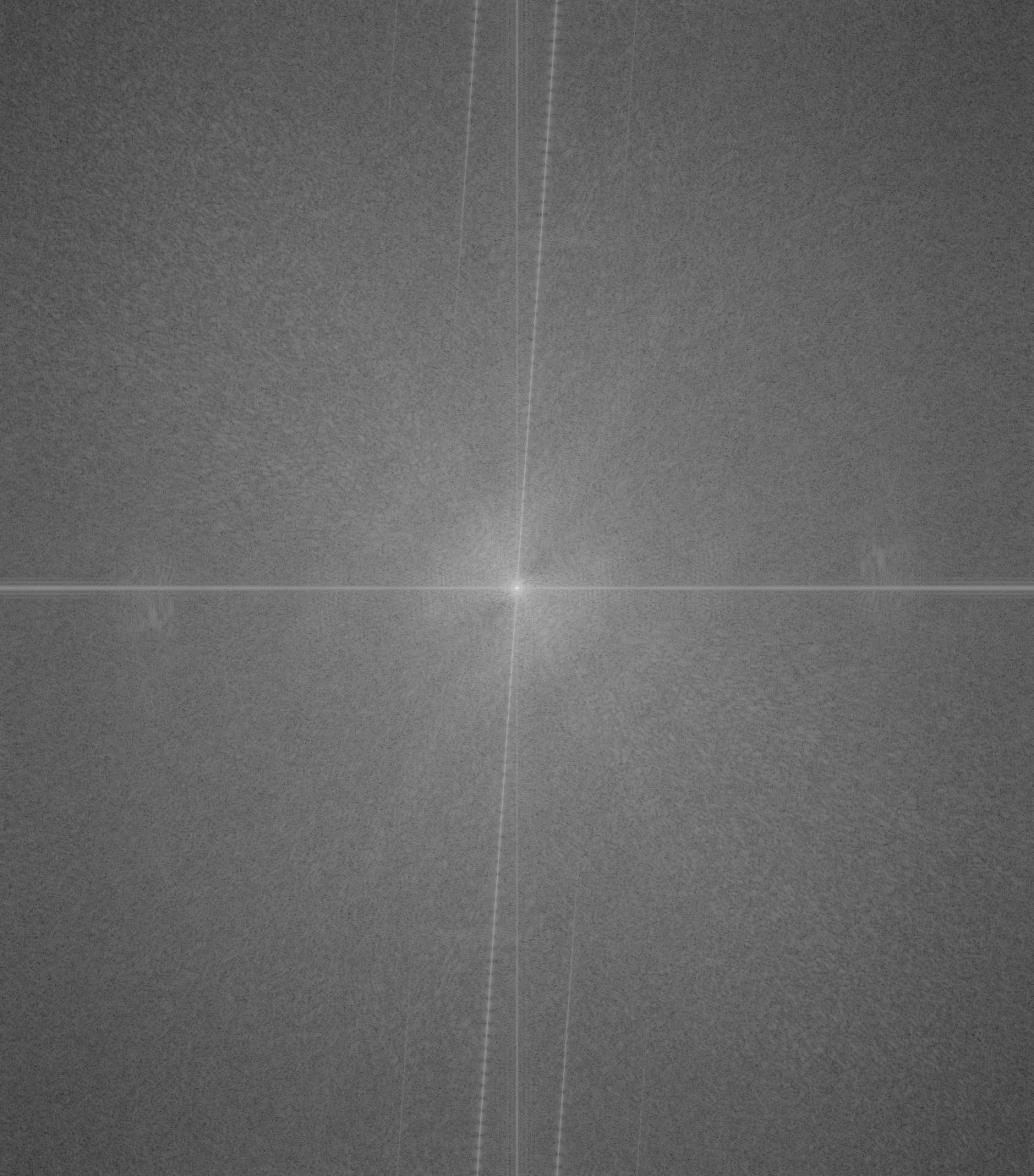
Hybrid FT
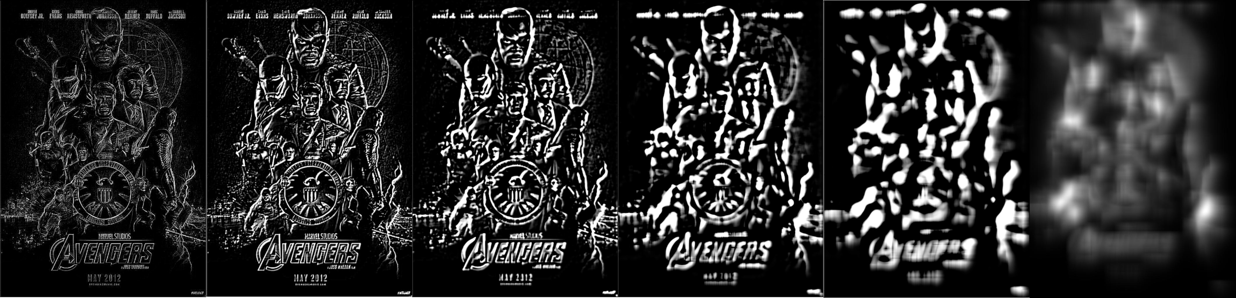
Here are few more examples that I ran:
"The professor of my favorite 61-series class and the 16th President of the United
States."
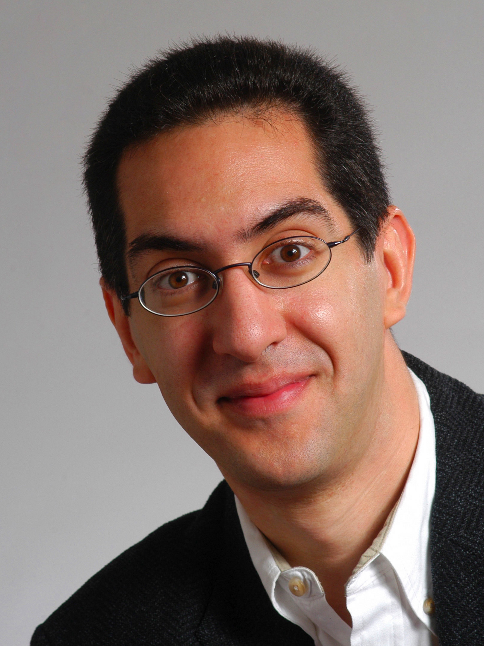
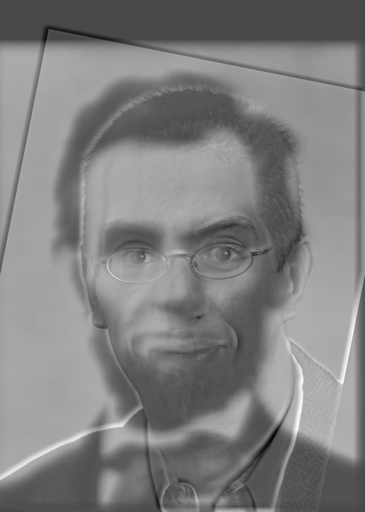
High: CS61C Professor Dan Garcia
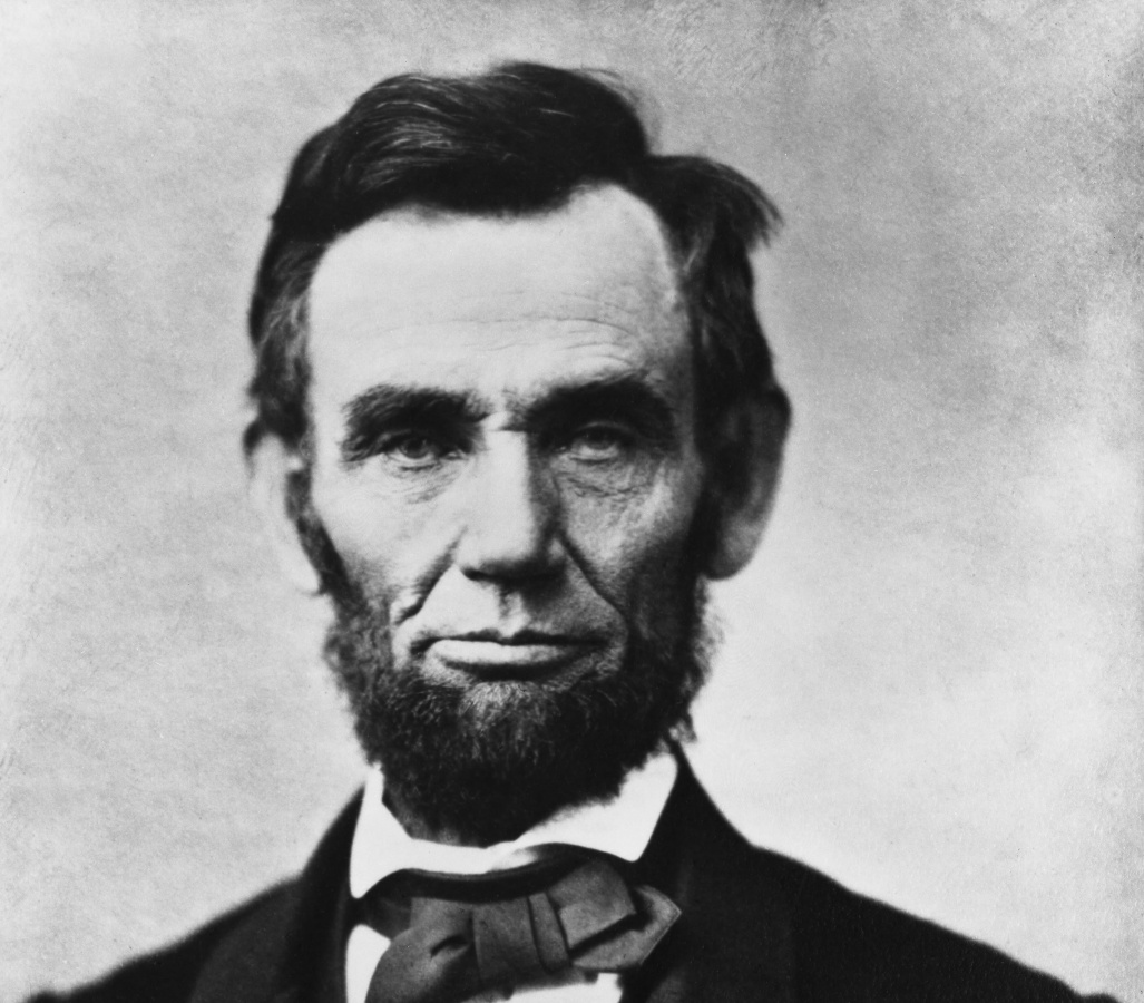
Low: President Abraham Lincoln
Result: Dabe Garlincoln
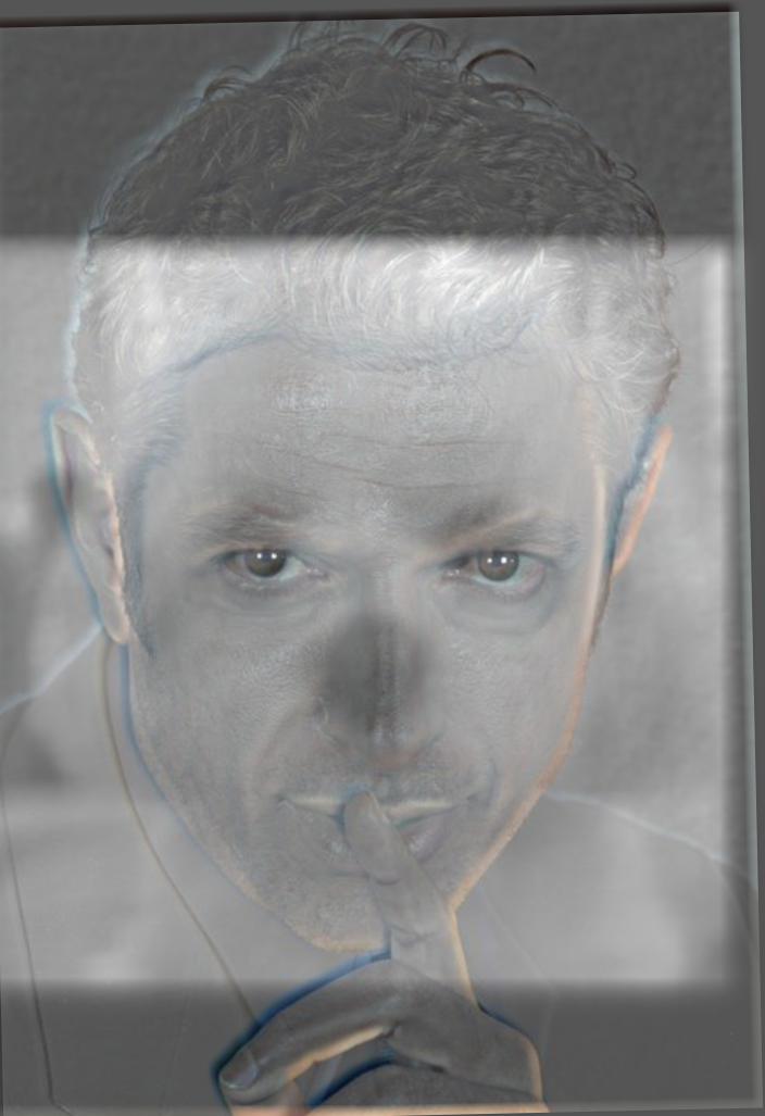
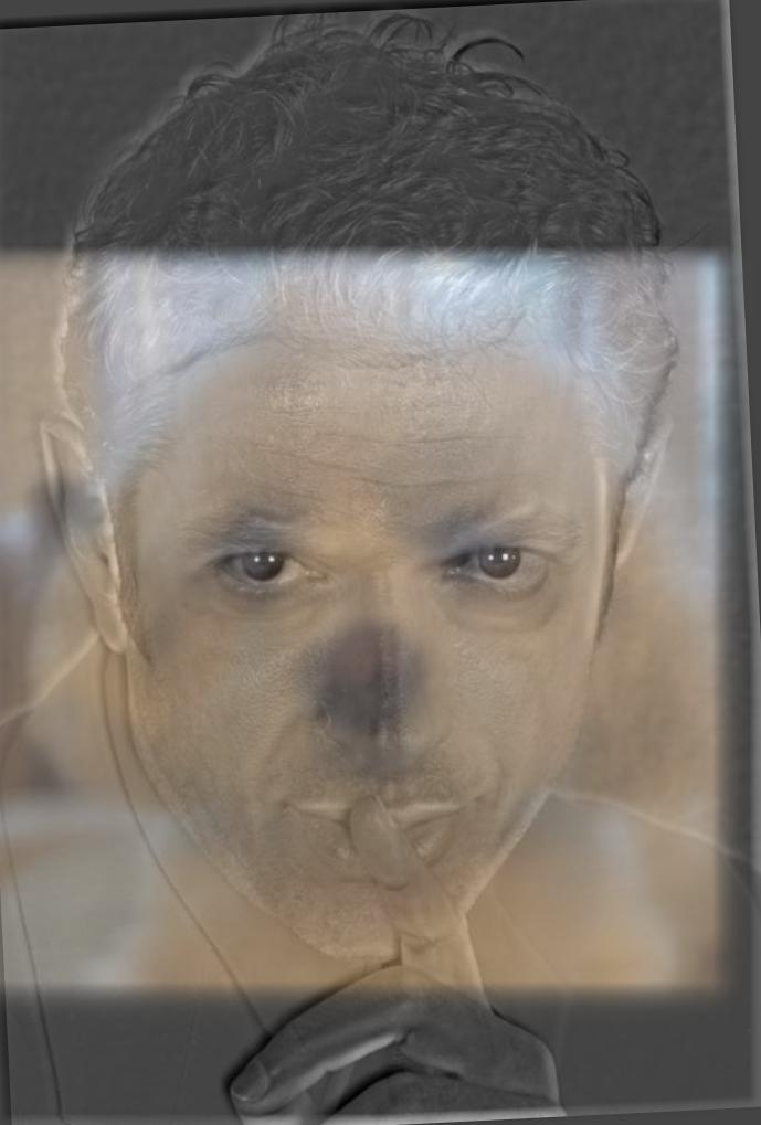
"My favorite actor and my favorite friend."
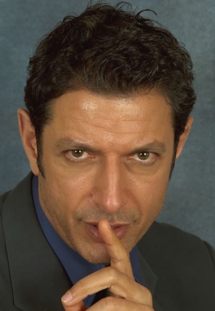
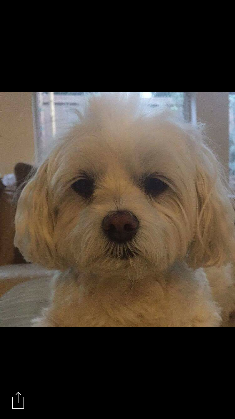
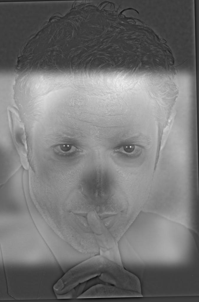
High: Actor Jeff Goldblum
Low: My Dog, Pebble
Result: Jebble Goldblubble
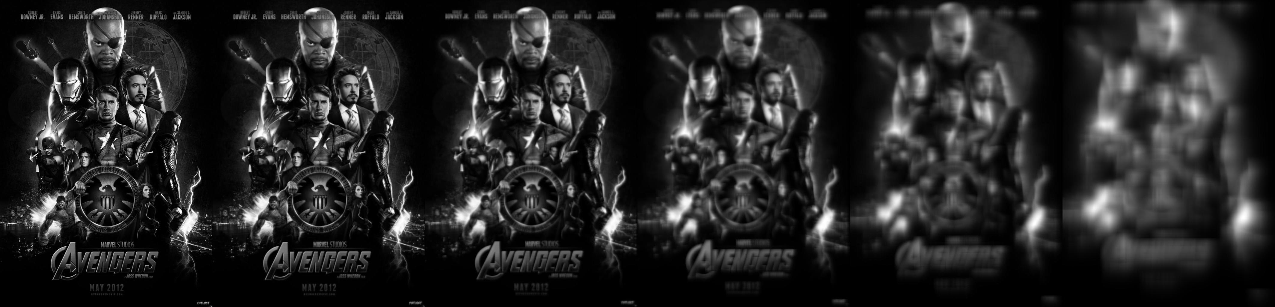
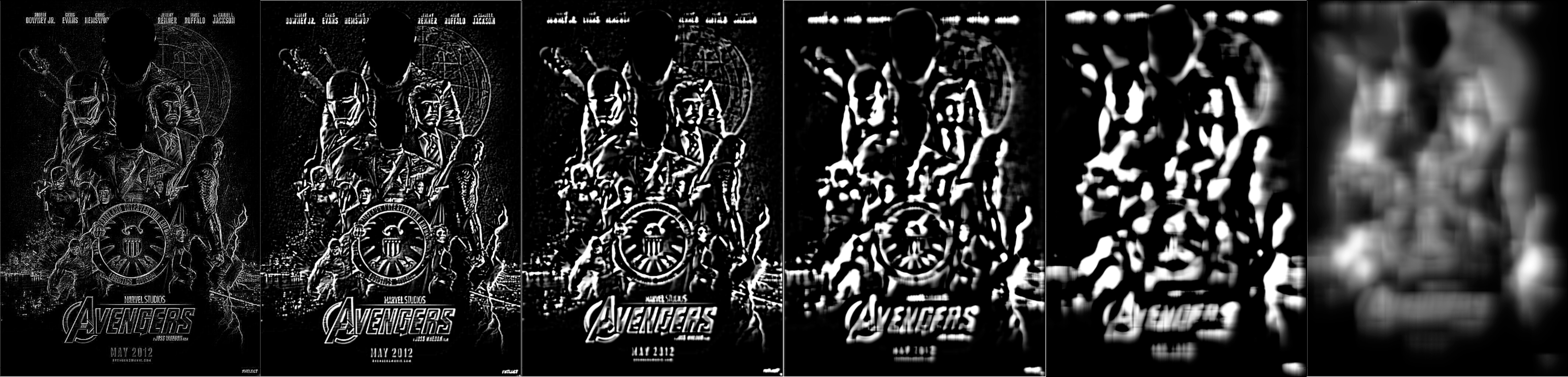
"My boss' boss' boss' boss' boss over the summer and his former boss."
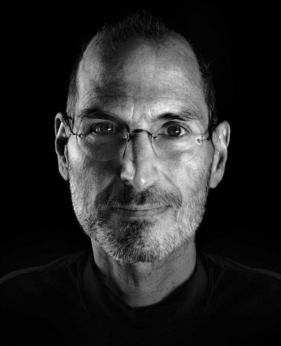
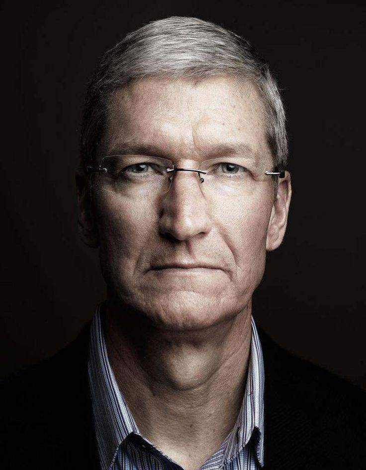
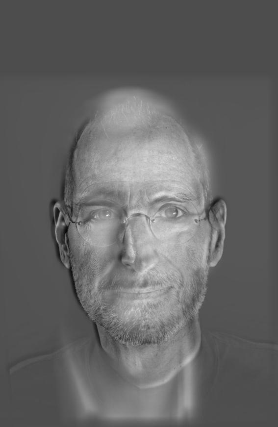
High: Apple Founder Steve Jobs
Low: Current Apple CEO Tim Cook
Result: Stim Jooks
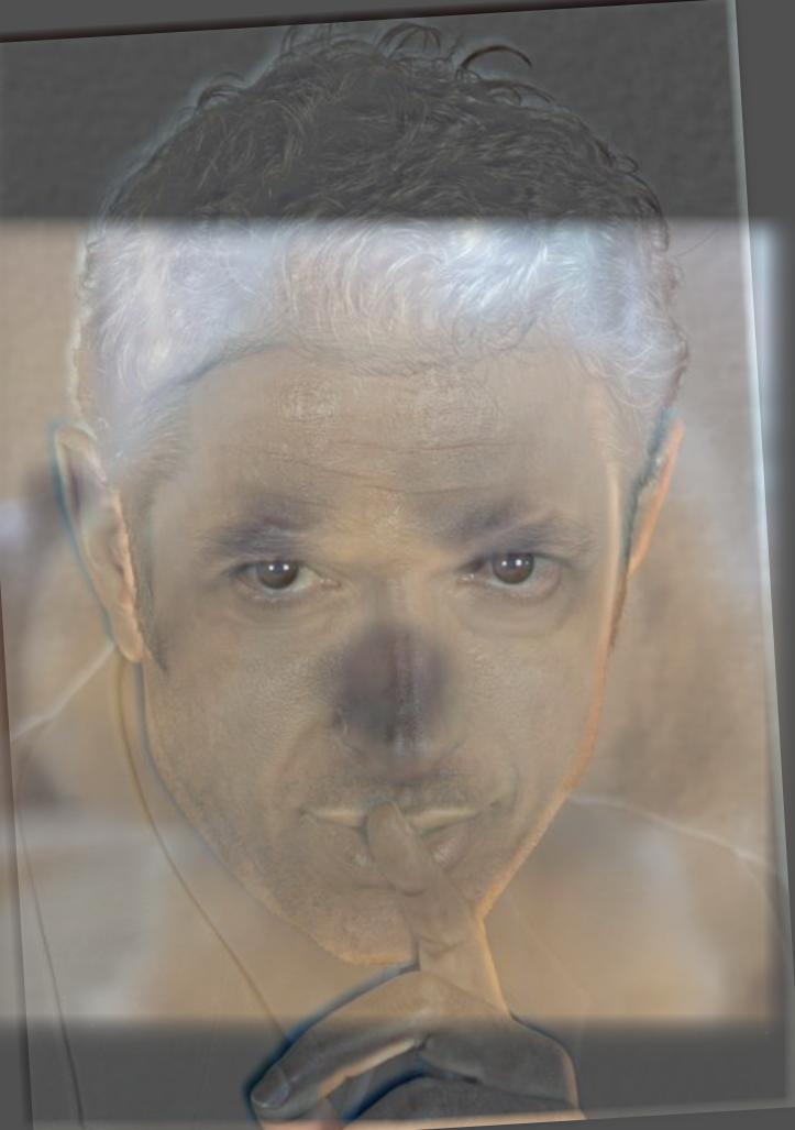
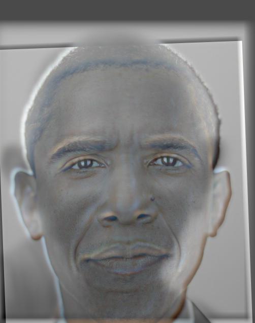
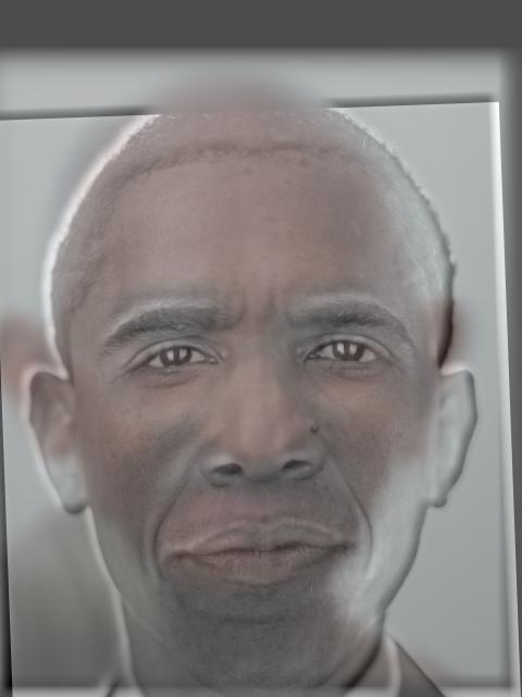
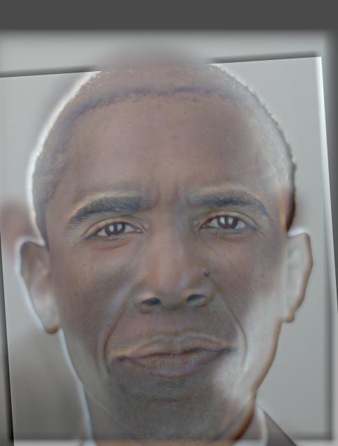
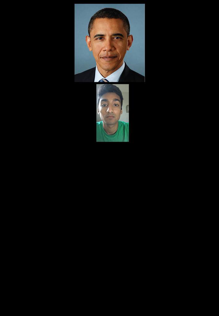
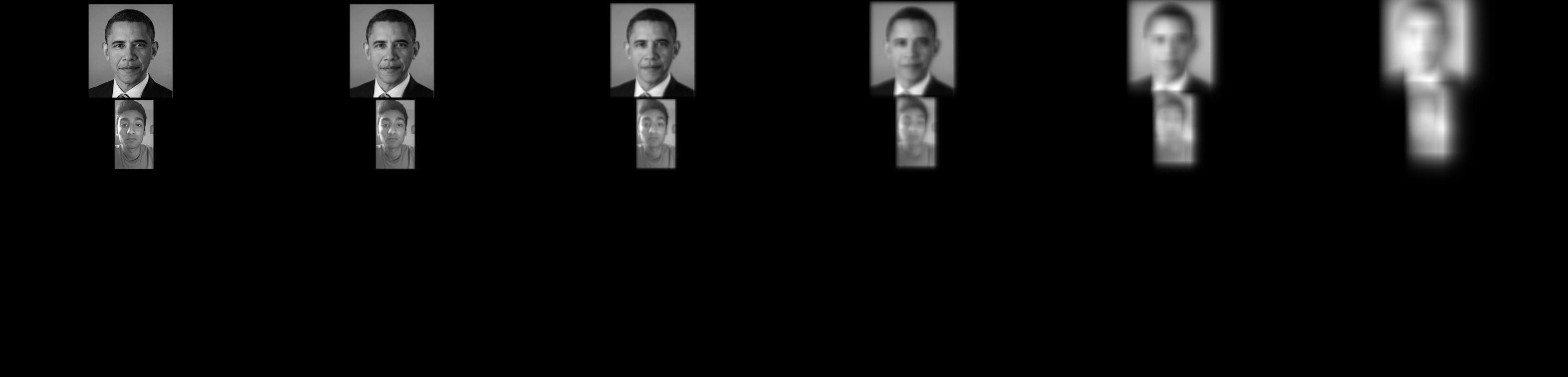
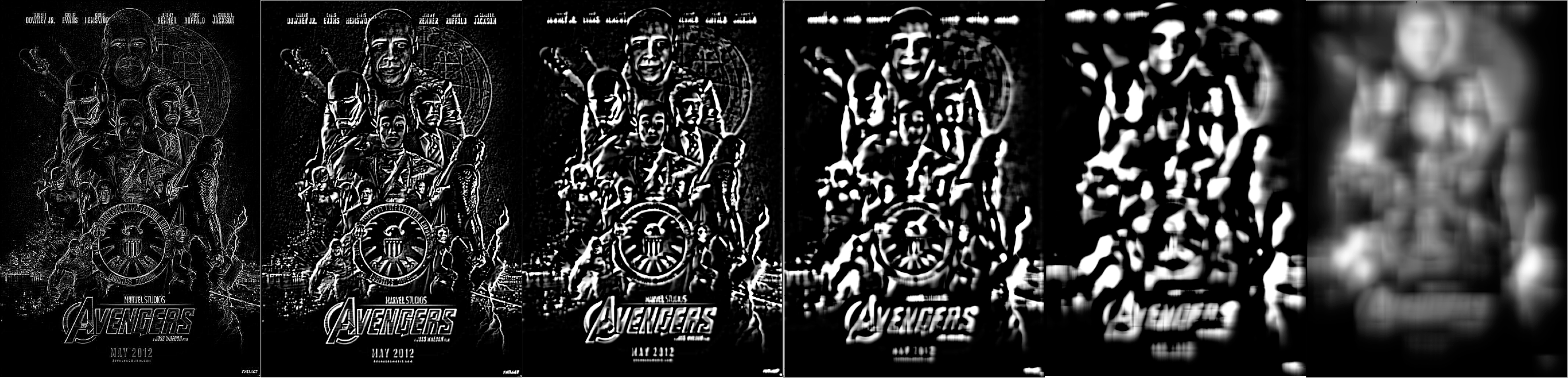
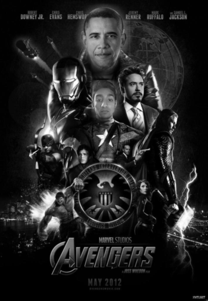
Here's one that didn't turn out very well. It's hard to discern Ghandi's features
at a distance and I think it is primarily due to Obama's face being larger than Ghandi's. Additionally, Ghandi
doesn't have pointy ears, or a thick beard, or anything that stands out when his image is blurred so it's difficult
to discern his figure.
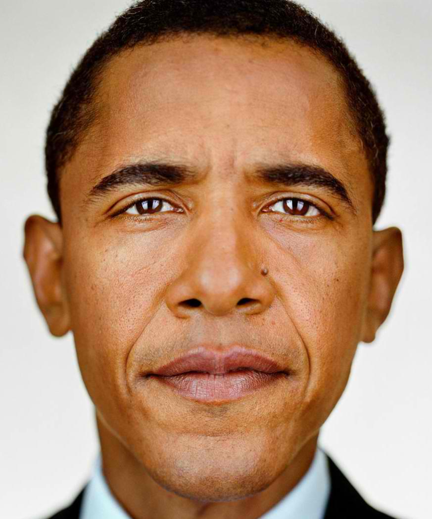
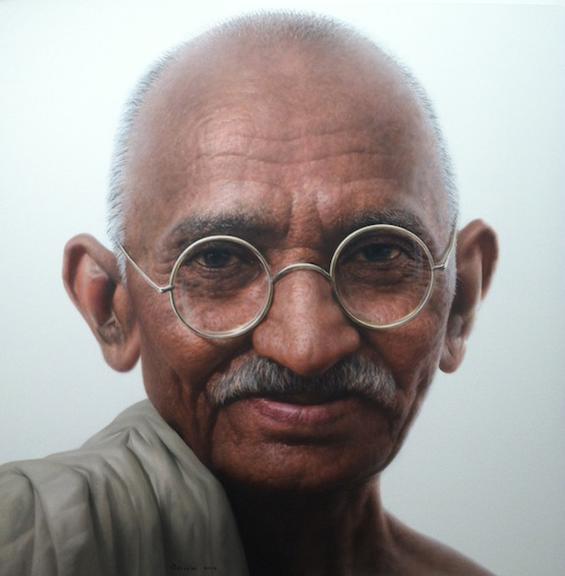
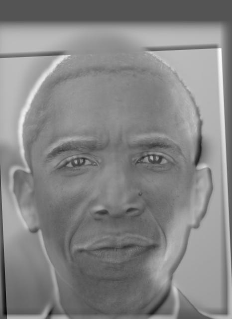
High: Current President Barack Obama
Low: Civil Rights Leader Mahatma Gandhi
Result: Ghandbama